目次
vue-agileとは
vue-agileは、Slickに触発されたVue.jsのカルーセルスライダーコンポーネントライブラリです。
サムネイルナビ付きのスライダーを実装することが可能です。
【ファイル容量:607 KB】
環境
| Vue | 2.6.10 |
| vue-agile | 1.0.11 |
インストール
以下のnpm、CDNを使ってインストールします。
npm
npm install vue-agile
yarn
yarn add vue-agile
CDN
<link rel="stylesheet" href="https://cdn.jsdelivr.net/npm/[email protected]/dist/VueAgile.css">
<script src="https://cdn.jsdelivr.net/npm/[email protected]/dist/VueAgile.umd.min.js"></script>
gitリポジトリは以下から取得できます。
https://github.com/lukaszflorczak/vue-agile
導入手順
1. ライブラリの取り込み
(1)ES6等の場合 [注意]モジュール版は未検証です。
import VueAgile from 'vue-agile'
(2)CDNの場合
const VueAgile = window['VueAgile'];
2.メソッドを設定
上記で取得したVueAgileを components に取り込みます。
new Vue({
  el: '#app',
  components: {
    'agile':VueAgile
  }
});
3. テンプレートを準備
<agile> を設置します。
スライドとして扱いたいタグにClassの slide を設定します。
[注意] サンプルはケバブケースで記載しています。
<div id="app">
  <agile :autoplay="true" :autoplay-speed="5000">
    <div class="slide" v-for="n in 4">
      <h3>slide {{n}}</h3>
    </div>
  </agile>
</div>
4. スタイルを適用
デフォルトだとスタイルが無いので以下を適用します。
.agile__actions{
  margin-top: 20px
}
.agile__nav-button {
  background: transparent;
  border: none;
  color: #ccc;
  cursor: pointer;
  font-size: 24px;
  transition-duration: .3s;
}
.agile__nav-button:hover {
  color: #888
}
.agile__dot{
  margin: 0 10px;
}
.agile__dot button{
  background-color: #eee;
  border: none;
  border-radius: 50%;
  cursor: pointer;
  display: block;
  height: 10px;
  font-size: 0;
  line-height: 0;
  margin: 0;
  padding: 0;
  transition-duration: .3s;
  width: 10px;
}
#app .agile__dot--current button,
#app .agile__dot:hover button{
  background-color: #888
}
#app .slide {
  align-items: center;
  color: #fff;
  display: flex;
  height: 300px;
  justify-content: center;
  background-color: #f1c40f;
}
.slide h3{
  font-size: 32px;
  font-weight: 300;
}
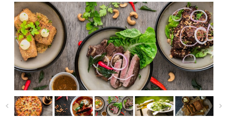
サンプル
サムネイルナビスライダー
スクリプト
new Vue({
  el: '#app',
  components: {
    'agile':VueAgile
  },
  data: {
    asNavFor1: [],
    asNavFor2: [],
    slides: [
      'https://images.unsplash.com/photo-1453831362806-3d5577f014a4?ixlib=rb-1.2.1&q=85&fm=jpg&crop=entropy&cs=srgb&w=650&fit=max&ixid=eyJhcHBfaWQiOjE0NTg5fQ',
      'https://images.unsplash.com/photo-1496412705862-e0088f16f791?ixlib=rb-1.2.1&q=85&fm=jpg&crop=entropy&cs=srgb&w=650&fit=max&ixid=eyJhcHBfaWQiOjE0NTg5fQ',
      'https://images.unsplash.com/photo-1506354666786-959d6d497f1a?ixlib=rb-1.2.1&q=85&fm=jpg&crop=entropy&cs=srgb&w=650&fit=max&ixid=eyJhcHBfaWQiOjE0NTg5fQ',
      'https://images.unsplash.com/photo-1455619452474-d2be8b1e70cd?ixlib=rb-1.2.1&q=85&fm=jpg&crop=entropy&cs=srgb&w=650&fit=max&ixid=eyJhcHBfaWQiOjE0NTg5fQ',
      'https://images.unsplash.com/photo-1504674900247-0877df9cc836?ixlib=rb-1.2.1&q=85&fm=jpg&crop=entropy&cs=srgb&w=650&fit=max&ixid=eyJhcHBfaWQiOjE0NTg5fQ',
      'https://images.unsplash.com/photo-1472926373053-51b220987527?ixlib=rb-1.2.1&q=85&fm=jpg&crop=entropy&cs=srgb&w=650&fit=max&ixid=eyJhcHBfaWQiOjE0NTg5fQ',
      'https://images.unsplash.com/photo-1497534547324-0ebb3f052e88?ixlib=rb-1.2.1&q=85&fm=jpg&crop=entropy&cs=srgb&w=650&fit=max&ixid=eyJhcHBfaWQiOjE0NTg5fQ'
    ],
    options1: {
      dots: false,
      fade: true,
      navButtons: false
    },
    options2: {
      autoplay: true,
      centerMode: true,
      dots: false,
      navButtons: false,
      slidesToShow: 3,
      responsive: [
        {
          breakpoint: 600,
          settings: {
            slidesToShow: 5
          }
        },
        {
          breakpoint: 1000,
          settings: {
            navButtons: true
          }
        }
      ]
    },
  },
  mounted: function () {
      this.asNavFor1.push(this.$refs.thumbnails);
      this.asNavFor2.push(this.$refs.main);
    }
});
HTML
asNavForを使うことで2つのスライダーを同期することができます。
<div id="app">
  <agile ref="main" :options="options1" :as-nav-for="asNavFor1" class="main">
    <div class="slide" v-for="(slide, index) in slides" :key="index" :class="`slide--${index}`">
      <img :src="slide">
    </div>
  </agile>
  <agile ref="thumbnails" :options="options2" :as-nav-for="asNavFor2" class="thumbnails">
    <div class="slide slide--thumbniail" v-for="(slide, index) in slides" :key="index" @click="$refs.thumbnails.goTo(index);" :class="`slide--${index}`">
      <img :src="slide">
    </div>
    <template slot="prevButton"><i class="fas fa-chevron-left"></i></template>
    <template slot="nextButton"><i class="fas fa-chevron-right"></i></template>
  </agile>
</div>
スタイル
今回のスライダー専用のスタイルを適用します。
.main{
  margin-bottom: 30px;
}
.thumbnails {
  margin: 0 -5px;
  width: calc(100% + 10px);
}
.agile__nav-button {
  background: transparent;
  border: none;
  color: #ccc;
  cursor: pointer;
  font-size: 24px;
  -webkit-transition-duration: 0.3s;
          transition-duration: 0.3s;
}
.thumbnails .agile__nav-button {
  position: absolute;
  top: 50%;
  -webkit-transform: translateY(-50%);
          transform: translateY(-50%);
}
.thumbnails .agile__nav-button--prev {
  left: -45px;
}
.thumbnails .agile__nav-button--next {
  right: -45px;
}
.agile__nav-button:hover {
  color: #888;
}
.agile__dot {
  margin: 0 10px;
}
.agile__dot button {
  background-color: #eee;
  border: none;
  border-radius: 50%;
  cursor: pointer;
  display: block;
  height: 10px;
  font-size: 0;
  line-height: 0;
  margin: 0;
  padding: 0;
  -webkit-transition-duration: 0.3s;
          transition-duration: 0.3s;
  width: 10px;
}
.agile__dot--current button, .agile__dot:hover button {
  background-color: #888;
}
.slide {
  -webkit-box-align: center;
          align-items: center;
  box-sizing: border-box;
  color: #fff;
  display: -webkit-box;
  display: flex;
  height: 450px;
  -webkit-box-pack: center;
          justify-content: center;
}
.slide--thumbniail {
  cursor: pointer;
  height: 100px;
  padding: 0 5px;
  -webkit-transition: opacity 0.3s;
  transition: opacity 0.3s;
}
.slide--thumbniail:hover {
  opacity: 0.75;
}
.slide img {
  height: 100%;
  -o-object-fit: cover;
     object-fit: cover;
  -o-object-position: center;
     object-position: center;
  width: 100%;
}
サンプル
さいごに
Slickに触発されたVue.jsのカルーセルスライダーコンポーネントライブラリでした。
今日はこの辺でー