目次
vue-mentionとは
vue-mentionは、TeamsやSlackみたいにメンションセレクト機能をテキストエリアに実装できるコンポーネントライブラリです。
「@」や「#」を使い分けることで、ユーザー検索やチケット検索などに切り替えることが可能です。
vue-mentionを使うには、「v-tooltip」のライブラリが必須です。
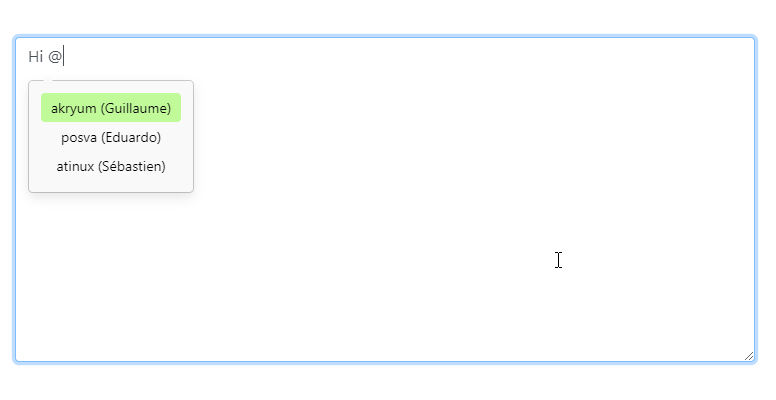
【動画サイズ:48KB】
環境
| Vue | 2.6.10 |
| vue-mention | 0.1.7 |
インストール
以下のnpm、yarn、CDNを使ってインストールします。
npm
npm i vue-mention
yarn
yarn add vue-mention
UMD
<script src="https://unpkg.com/v-tooltip"></script>
<script>
// v-tooltipが必須
const vTooltip  = VTooltip;
Vue.use(VTooltip);
</script>
<script src="https://cdn.jsdelivr.net/npm/[email protected]/dist/vue-mention.min.js"></script>
gitリポジトリは以下から取得できます。
https://github.com/Akryum/vue-mention
導入手順
1. ライブラリの取り込み
(1)ES6等の場合 [注意]モジュール版は未検証です。
import { Mentionable } from 'vue-mention'
(2)UMDの場合
const Mentionable = window['VueMention'].Mentionable;
2.メソッドを設定
Mentionableをcomponentsに取り込みます。
メンションで呼び出すユーザー用とチケット用の配列を準備します。
「@」などの呼び出しの分岐用にonOpenメソッドを作成します。
new Vue({
  el: '#app',
  components: {
    'mentionable': Mentionable,
  },
  data: {
    text: '',
    items: [],
    users: [
      {
        value: 'akryum',
        firstName: 'Guillaume',
      },
      {
        value: 'posva',
        firstName: 'Eduardo',
      },
      {
        value: 'atinux',
        firstName: 'Sébastien',
      },
    ],
    issues: [
      {
        value: 123,
        label: 'Error with foo bar',
        searchText: 'foo bar'
      },
      {
        value: 42,
        label: 'Cannot read line',
        searchText: 'foo bar line'
      },
      {
        value: 77,
        label: 'I have a feature suggestion',
        searchText: 'feature'
      }
    ]
  },
  methods: {
    onOpen:function (key) {
      this.items = key === '@' ? this.users : this.issues
    },
  },
});
3. テンプレートを準備
<mentionable> を設置します。
keysにメンション用の呼び出しを設定します。
上記で作成したonOpenをopenイベントで呼び出します。
メンションの呼び出しで表示内容を変更するようにテンプレートを設置します。
[注意] サンプルはケバブケースで記載しています。
<div id="app">
  <mentionable
    :keys="['@', '#']"
    :items="items"
    offset="6"
    @open="onOpen"
  >
    <textarea v-model="text" rows="8"></textarea>
    <template #no-result>
      <div class="dim">
        No result
      </div>
    </template>
    <template #item-@="{ item }">
      <div class="user">
        {{ item.value }}
        <span class="dim">
          ({{ item.firstName }})
        </span>
      </div>
    </template>
    <template #item-#="{ item }">
      <div class="issue">
        <span class="number">
          #{{ item.value }}
        </span>
        <span class="dim">
          {{ item.label }}
        </span>
      </div>
    </template>
  </mentionable>
</div>
4. スタイルを作成
v-tooltipとvue-mentionは、両方ともベーススタイルが用意されていないので、自作する必要があります。
今回は下記のスタイルを適用します。
.tooltip {
    display: block!important;
    z-index: 10000
}
.tooltip .tooltip-inner {
    background: #000;
    color: #fff;
    border-radius: 16px;
    padding: 5px 10px 4px
}
.tooltip .tooltip-arrow {
    width: 0;
    height: 0;
    border-style: solid;
    position: absolute;
    margin: 5px;
    border-color: #000;
    z-index: 1
}
.tooltip[x-placement^=top] {
    margin-bottom: 5px
}
.tooltip[x-placement^=top] .tooltip-arrow {
    border-width: 5px 5px 0;
    border-left-color: transparent!important;
    border-right-color: transparent!important;
    border-bottom-color: transparent!important;
    bottom: -5px;
    left: calc(50% - 5px);
    margin-top: 0;
    margin-bottom: 0
}
.tooltip[x-placement^=bottom] {
    margin-top: 5px
}
.tooltip[x-placement^=bottom] .tooltip-arrow {
    border-width: 0 5px 5px;
    border-left-color: transparent!important;
    border-right-color: transparent!important;
    border-top-color: transparent!important;
    top: -5px;
    left: calc(50% - 5px);
    margin-top: 0;
    margin-bottom: 0
}
.tooltip[x-placement^=right] {
    margin-left: 5px
}
.tooltip[x-placement^=right] .tooltip-arrow {
    border-width: 5px 5px 5px 0;
    border-left-color: transparent!important;
    border-top-color: transparent!important;
    border-bottom-color: transparent!important;
    left: -5px;
    top: calc(50% - 5px);
    margin-left: 0;
    margin-right: 0
}
.tooltip[x-placement^=left] {
    margin-right: 5px
}
.tooltip[x-placement^=left] .tooltip-arrow {
    border-width: 5px 0 5px 5px;
    border-top-color: transparent!important;
    border-right-color: transparent!important;
    border-bottom-color: transparent!important;
    right: -5px;
    top: calc(50% - 5px);
    margin-left: 0;
    margin-right: 0
}
.tooltip.popover .popover-inner {
    background: #f9f9f9;
    color: #000;
    padding: 12px;
    border-radius: 5px;
    box-shadow: 0 5px 12px rgba(0,0,0,.1)
}
.tooltip.popover .popover-arrow {
    border-color: #f9f9f9
}
.tooltip[aria-hidden=true] {
    visibility: hidden;
    opacity: 0;
    transition: opacity .15s,visibility .15s
}
.tooltip[aria-hidden=false] {
    visibility: visible;
    opacity: 1;
    transition: opacity .15s
}
.mention-item {
  padding: 4px 10px;
  border-radius: 4px;
}
.mention-selected {
  background: rgb(192, 250, 153);
}
サンプル
さいごに
TeamsやSlackみたいにメンションセレクト機能をテキストエリアに実装できるコンポーネントライブラリでした。
CDNのumdがうまく動かず、若干手間取りました。
使ってみると非常に面白いライブラリなので、ぜひ試してみてください。
今日はこの辺でー